
Ana Tudor 🐯<p>Ever wanted to get the number of auto-fit columns in CSS?</p><p>```<br>--u: 5em;<br>grid-template-columns: repeat(auto-fit, minmax(var(--u), 1fr))<br>```</p><p>It's now possible! Using registered <a href="https://mastodon.social/tags/CSS" class="mention hashtag" rel="nofollow noopener" target="_blank">#<span>CSS</span></a> vars, the tan division hack and container query units! Here's a little test on <span class="h-card" translate="no"><a href="https://fosstodon.org/@codepen" class="u-url mention" rel="nofollow noopener" target="_blank">@<span>codepen</span></a></span>: <br> <a href="https://codepen.io/thebabydino/pen/JojpBJr" rel="nofollow noopener" translate="no" target="_blank"><span class="invisible">https://</span><span class="ellipsis">codepen.io/thebabydino/pen/Joj</span><span class="invisible">pBJr</span></a></p><p><a href="https://mastodon.social/tags/cssGrid" class="mention hashtag" rel="nofollow noopener" target="_blank">#<span>cssGrid</span></a> <a href="https://mastodon.social/tags/cssLayout" class="mention hashtag" rel="nofollow noopener" target="_blank">#<span>cssLayout</span></a> <a href="https://mastodon.social/tags/code" class="mention hashtag" rel="nofollow noopener" target="_blank">#<span>code</span></a> <a href="https://mastodon.social/tags/coding" class="mention hashtag" rel="nofollow noopener" target="_blank">#<span>coding</span></a> <a href="https://mastodon.social/tags/web" class="mention hashtag" rel="nofollow noopener" target="_blank">#<span>web</span></a> <a href="https://mastodon.social/tags/dev" class="mention hashtag" rel="nofollow noopener" target="_blank">#<span>dev</span></a> <a href="https://mastodon.social/tags/webDev" class="mention hashtag" rel="nofollow noopener" target="_blank">#<span>webDev</span></a> <a href="https://mastodon.social/tags/webDevelopment" class="mention hashtag" rel="nofollow noopener" target="_blank">#<span>webDevelopment</span></a> <a href="https://mastodon.social/tags/layout" class="mention hashtag" rel="nofollow noopener" target="_blank">#<span>layout</span></a> <a href="https://mastodon.social/tags/frontend" class="mention hashtag" rel="nofollow noopener" target="_blank">#<span>frontend</span></a></p>

Administered by:
#cssgrid
3 posts1 participant0 posts today

#Development #Techniques
Conditional CSS grid template areas · A magic formula to “open the gates to layout heaven.” https://ilo.im/161t0f
_____
#Layout #CssGrid #CssNesting #ContainerQueries #LogicalProperties #ResponsiveDesign #WebDesign #WebDev #Frontend #CSS
#Development #Fun
CSS lessons for your parking fails · Proper car positioning may be easier than you think https://ilo.im/161t84
_____
#Positioning #Spacing #CssFloat #CssTransform #CssFlexbox #CssGrid #Development #WebDev #Frontend #CSS

 @anatudor@mastodon.social
I made a thing: scroll-driven, almost pure #CSS infinite circular gallery rotation - check it out on @codepen
https://codepen.io/thebabydino/pen/XJrYqGb
Using scroll-driven animations and the tiniest bit of JS for the infinity part of it.
Made with  for this week's #CodePenChallenge.
cc @bramus
GIF
@anatudor@mastodon.socialHere's a little thing I made for the 1st #CodePenChallenge of '25: pure #CSS tilt & zoom grid on scroll!
Check it out on @codepen
https://codepen.io/thebabydino/pen/jENzprY
Using pure CSS scroll driven animations, grid, variables, mathematical functions, container query units. Also uses an SVG filter for the dissolve effect.
Chromium only.
GIF
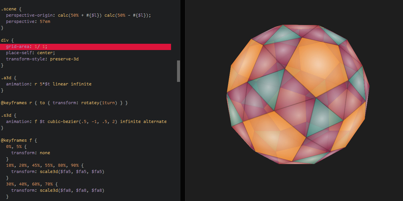
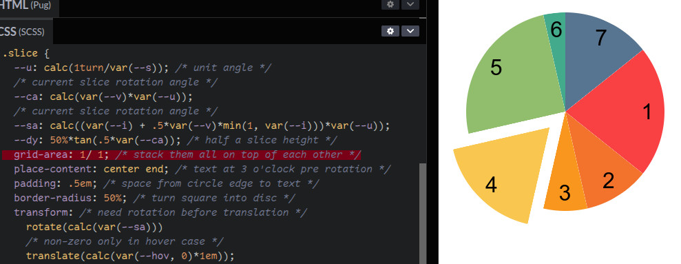
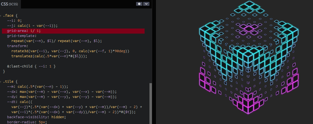
@anatudor@mastodon.social#tinyCSSsnippet I've been shocked  to learn has been slept on:
```
.container { display: grid }
.stacked-item { grid-area: 1/ 1 }
```
I use it all the time to stack elements.
Stack faces of polyhedra before positioning them in 3D. Stack images. Stack  slices https://codepen.io/thebabydino/pen/XWvKjJJ

 @anatudor@mastodon.social
Saw https://www.youtube.com/watch?v=An3QMWg3m1c linked last evening & gave the challenge a quick go myself.
My approach was a mostly #CSS one, with minimal HTML (no extra wrappers) and JS (used only to update top item index, ~200 bytes minified).
While it was working, it wasn't pretty, so today I polished the demo & heavily commented the CSS - check it out on @codepen: https://codepen.io/thebabydino/pen/jENaPjd
GIF
@anatudor@mastodon.socialI've mostly moved from absolute positioning to grid stacking:
.wrapper { display: grid }
.stack-item { grid-area: 1/ 1 }
But there's still one case where absolute positioning stacking makes sense: a stacked item is a text node (not an element or pseudo, so there's no CSS selector to select it).

CSS Grid Generator:
“Set the numbers, and units of your columns and rows, and I'll generate a CSS grid for you! Drag within the boxes to create divs placed within the grid.” @sarah_edo
https://cssgrid-generator.netlify.app/ #CSSGrid #css #layout #tools #design #webdesign
cssgrid-generator.netlify.appCSS Grid Generator
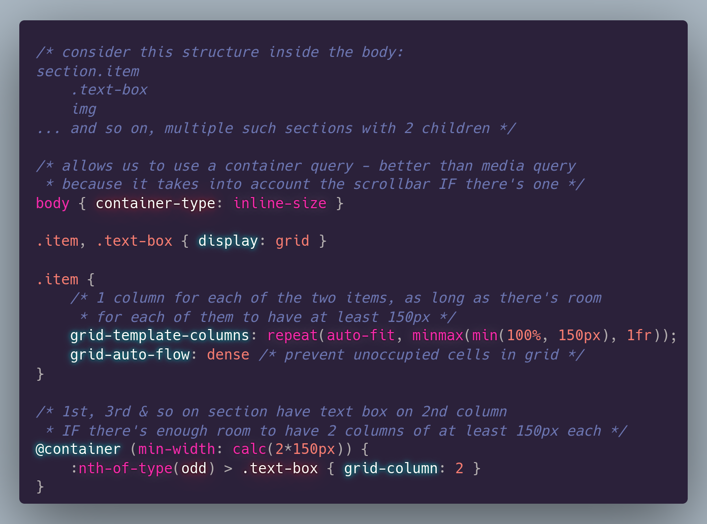
@anatudor@mastodon.social#tinyCSStip Container queries on the body? Why, when media queries have better support?
Well, container queries make it an IF depending on the width of the body's content-box.
That is, subtracting the scrollbar IF we have one (we can't know).
**Heavily** commented @codepen demo https://codepen.io/thebabydino/pen/ZEgjpYL
 @anatudor@mastodon.social
Another super old @codepen demo I redid with modern #CSS is this yummy menu https://codepen.io/thebabydino/pen/AoxZQq
CSS grid instead of absolute positioning, clip-path instead of nested skew and un-skew, CSS variables to avoid setting a separate transform chain on each item... and more!
GIF
@anatudor@mastodon.socialOne #CSS property I use a lot is `grid-area`.
In this basic @codepen example, `grid-area` (through its `grid-row` and `grid-column` components) is all that changes value between the narrow and wide screen cases (for the nav items wrapper and for the search wrapper) https://codepen.io/thebabydino/pen/YzmrXZo
GIF